Overview
Project type: Design Sprint
Role: UX Researcher, Ideation, Asset Collector, Prototyping, Testing
Timeline: 4 days
Tools: InVision, Figma
Design Process
Discovery Ideate Build Finalize Present
01 Discovery
In this 4-day sprint, we were assigned to design for an existing non-profit, NGO, or charitable social enterprise of our team's choosing. After that, we need to:
- Evaluate the usability of the organization's landing page and donation experience;
- Discuss, prioritize, and redesign usability enhancements in a new version of the organization's mobile app, or responsive website homepage/landing page and donation experience);
- Justify our rationale and approach to improving the experience.
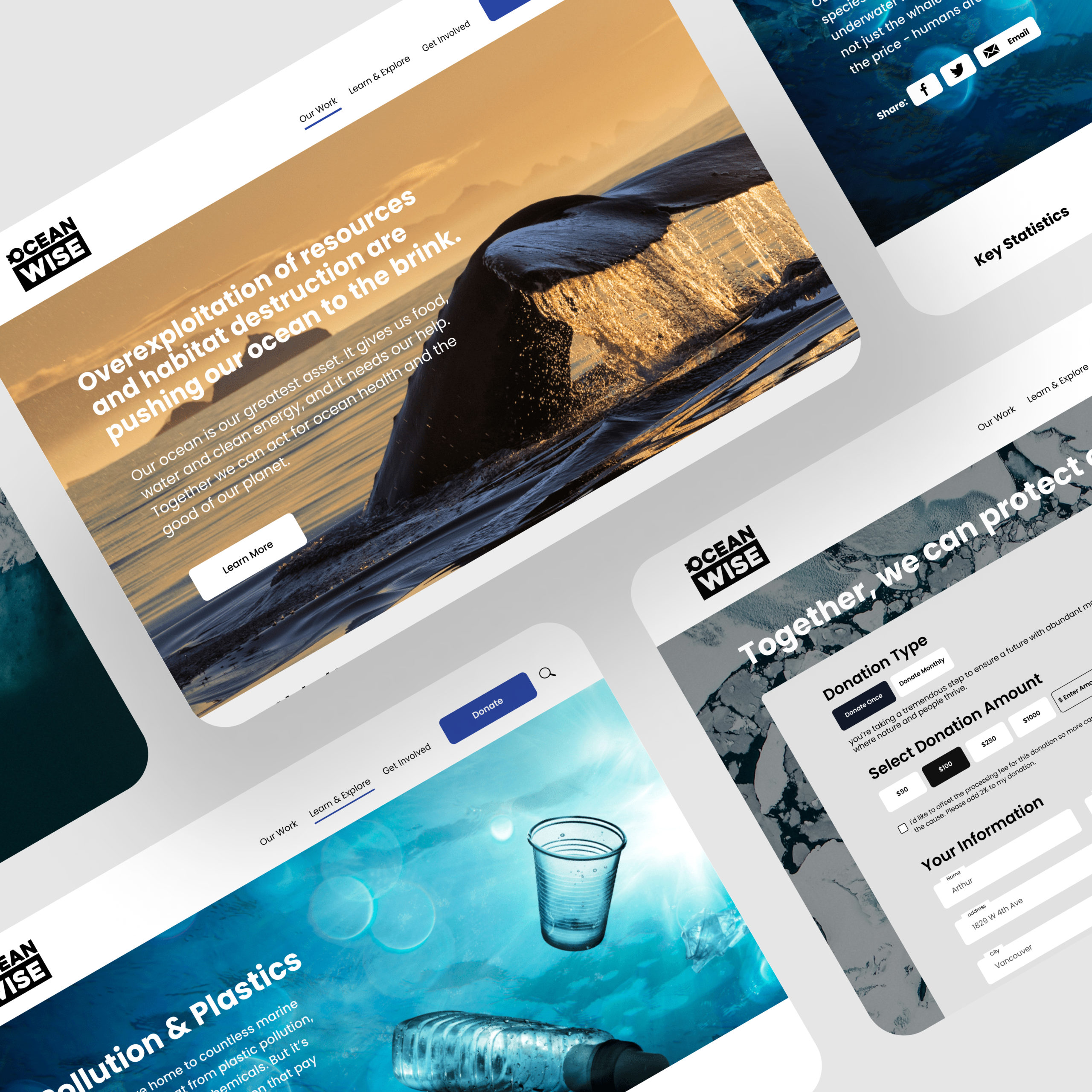
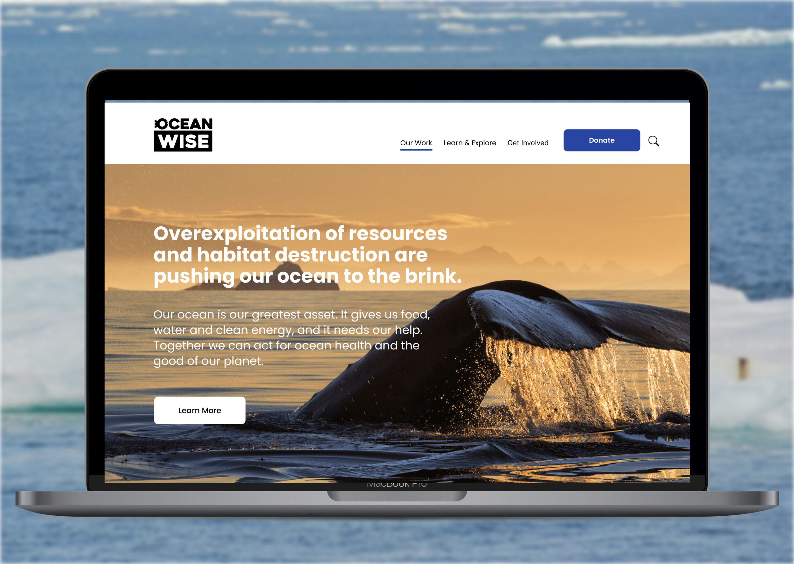
Our team chose Ocean Wise, a Vancouver-based nonprofit organization whose mission is to "empower communities and individuals to take action to protect and restore our world’s oceans". Since the organization only has website, we decided to redesign its marketing site and refine its existing donation experience.
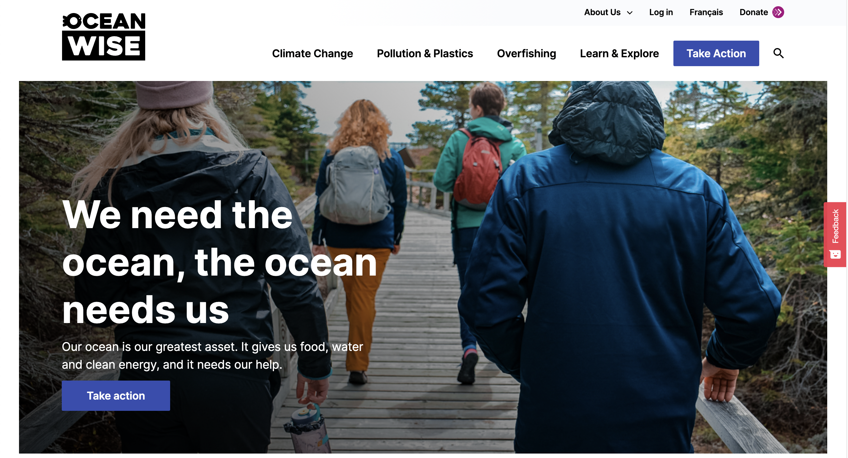
The original landing page of Ocean Wise
- Secondary Research
We first conducted some research on the Ocean Wise website, and we organized our findings as below.
What is working:
- climate change, pollution in plastics, and overfishing are their main focus;
- call to action button exists and is bolded;
- imagery is great, beautiful, and important to the cause;
- information is laid out well.
What could be improved:
- typography;
- Social media reach can be improved --> 18.2K on Instagram;
- improve ways in which people can contribute;
- no app for donating, must be done on a mobile or desktop website.
To further understand our design target and confirm our target users, we then search for the studies that are related to the goal of our project. We found that:
People are generally more philanthropic toward the end of their lives when they tend to have more savings, time, and motivation to help others. (Giving peaks at ages 61-75, when 77 percent of households donate, compared to just over 60 percent among households headed by someone 26-45 years old.)
Therefore, we confirmed that our goal for this project is to increase awareness about ocean-related environmental issues through social media reach and increase donations and support for people 26-45.
- User Interview
To know more about our target users (age 26-45), we created a list of open-ended questions and expanded this to a list of deeper, specific questions. We recruited 5 users to talk about their experiences, attitudes, needs , and goals relating to the project topic.
We summarized 8 insights out of the interview notes and voted on the How Might We questions proposed by each of us.
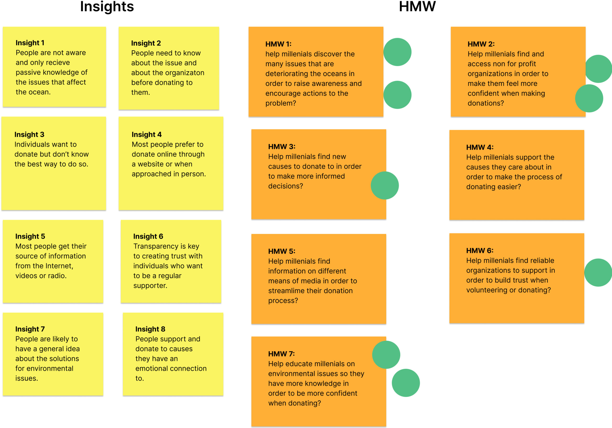
We end up combining HMW 1 and 7, as we thought "raising awareness" and "call to action" are equally important and interconnected.
How Might We educate people aged 26-45 on the many issues that are deteriorating the oceans in order to raise awareness and encourage donations?
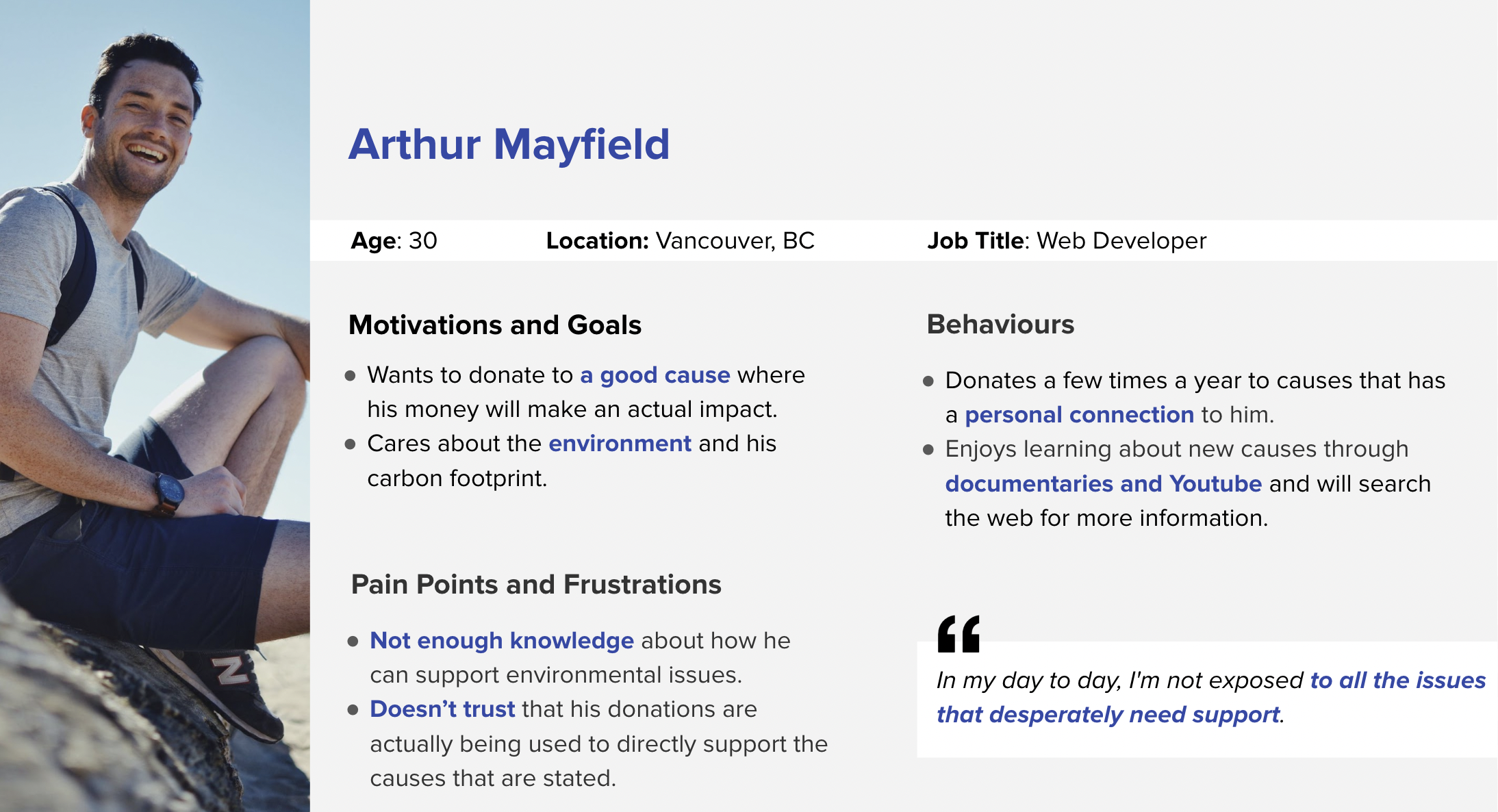
- Persona
Considering our target users and proposed goal, we crafted the persona, Arthur.
02 Ideate
At this pre-design stage, we used pen and paper to sketch out possible solutions for Ocean Wise.
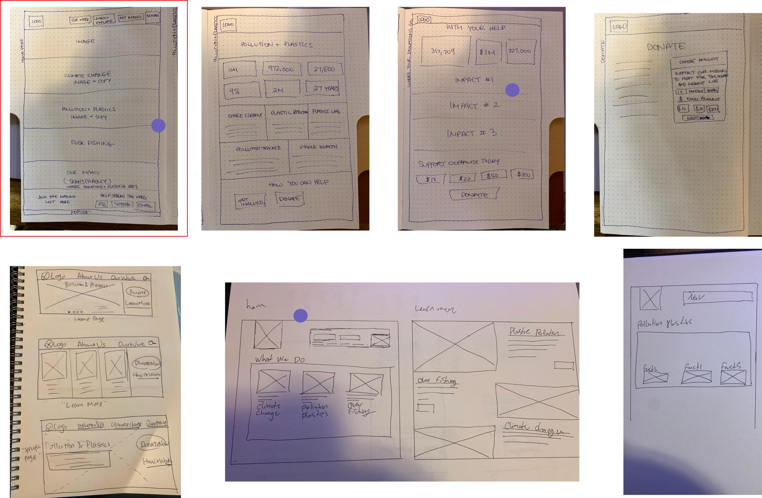
We explored different layouts and features of Ocean Wise, and finalized with the first flow (framed one)
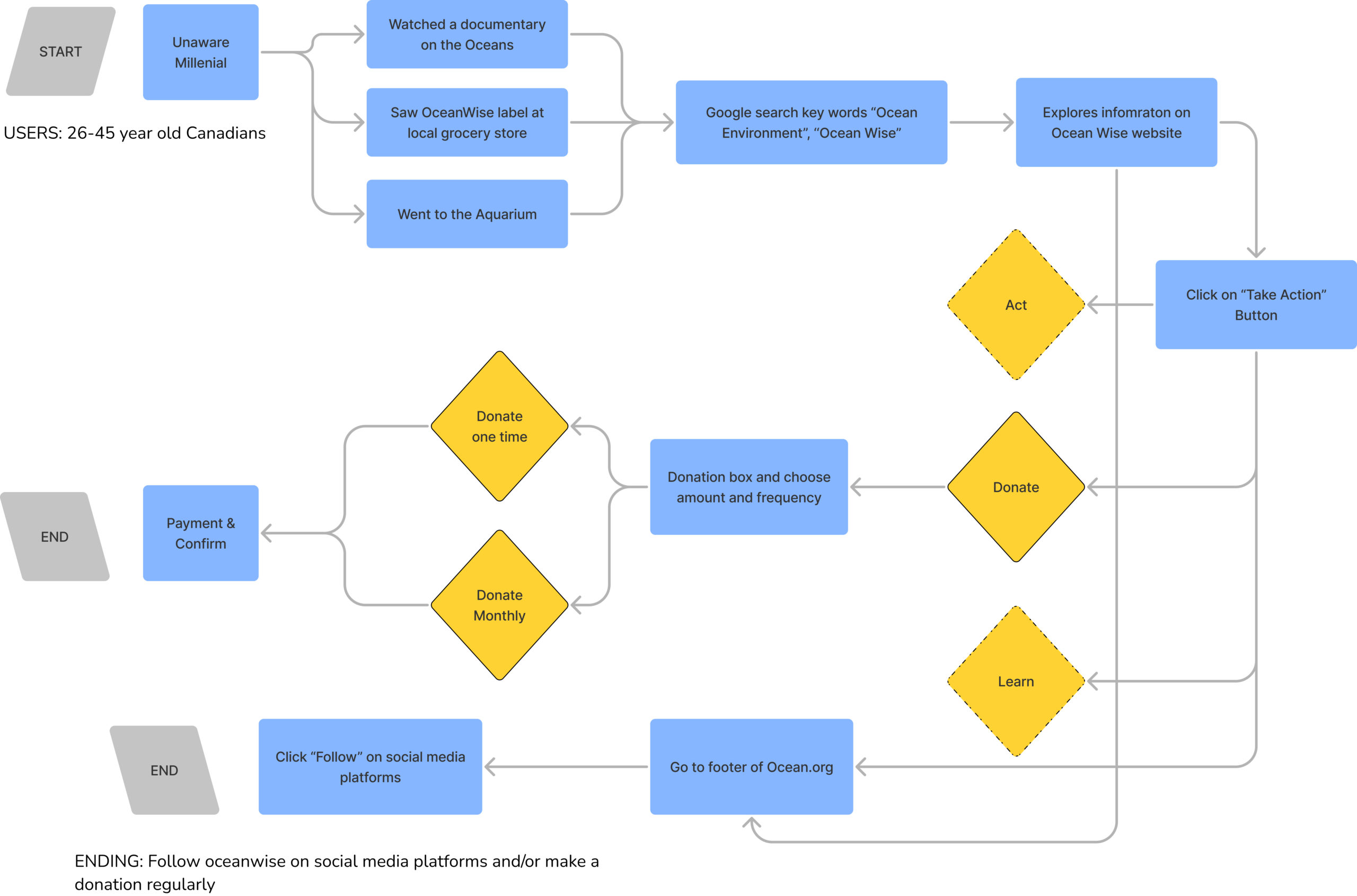
- User Journey Map
We mapped out the journey of our target user, starting with being aware of Ocean Wise and ending with a successful donation.
03 Build
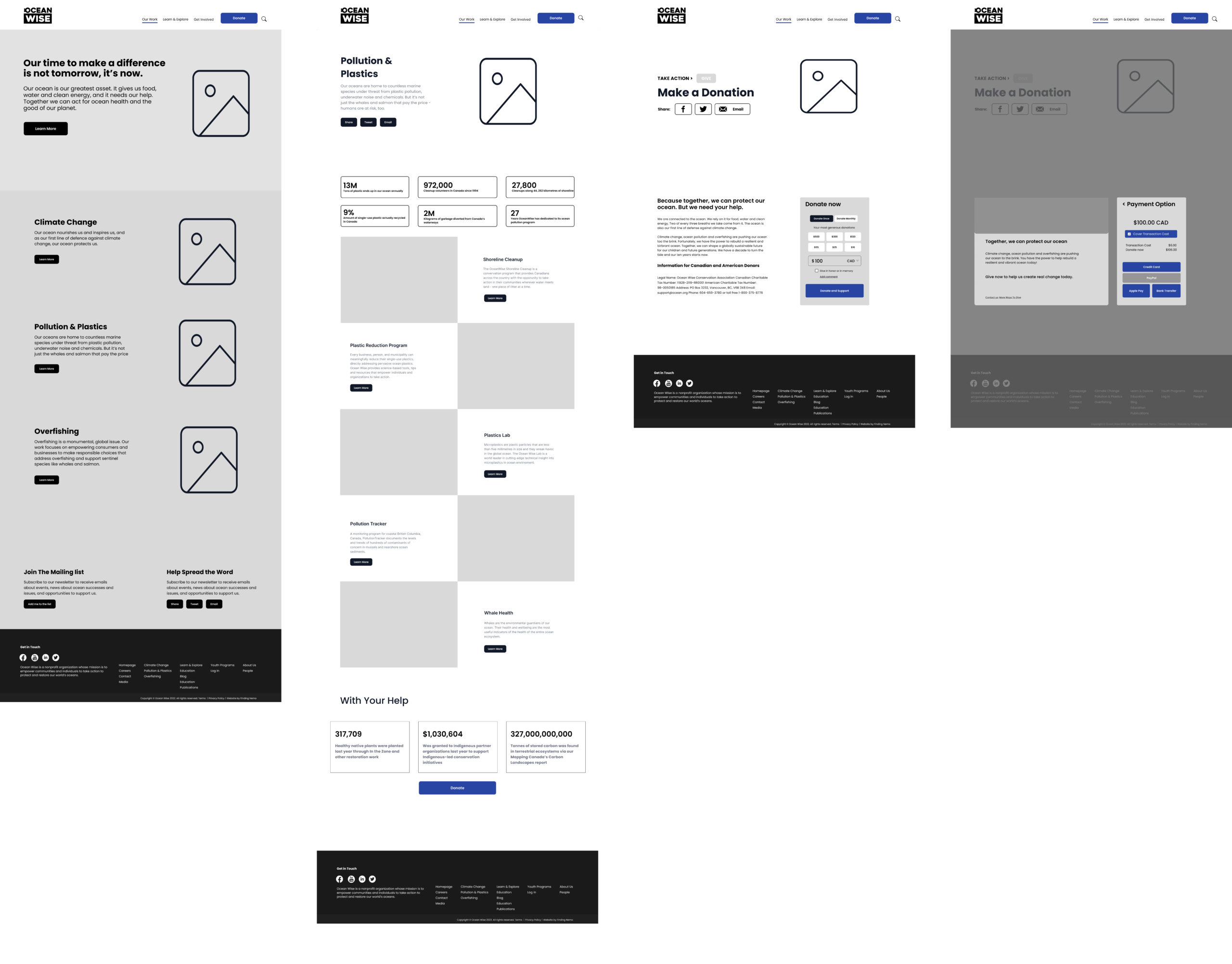
- Greyscale Wireframing & Prototyping
With the UI inspiration from Ocean Wise and other marketing websites, we wireframed our journey map while optimizing the donation process. We also highlight the statistics that indicate where the money goes to make the users more confident about their donation.
- Usability Testing
After the first greyscale prototype, we conducted usability testing to gain feedback from users.The key insights are:
- Optimize user’s donation experience from pop-ups to a form;
- Move the donation box to the top of the page to be more obvious to the user;
- Made the font size bigger;
- Include a more visual representation of the statistics.
04 Finalize
- Final Prototype
For the final prototype, we injected color from the style guide of Ocean Wise. We tried to maintain the key themes of the website while making it more user-centered.
04 Present
On the presentation day, we turned our work into a 6-minute slide show with a walkthrough of our interactive high-fidelity prototype.
Selected Works
Ocean WiseUX/UI Design丨4-day Sprint
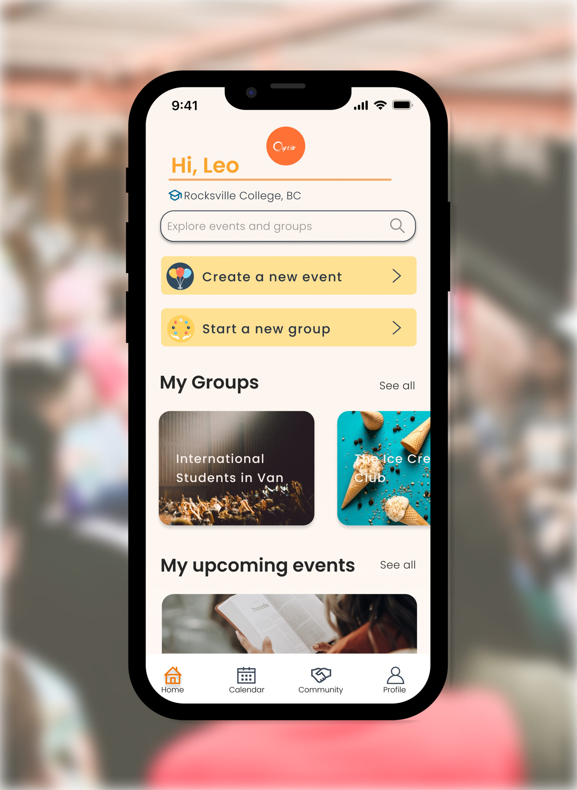
OystarUX/UI Design丨Case Study
Get in touch with opportunities or just to say hi 